Skip to the content
Alexander Darabi BA (Hons) Digital AnimationAlexander Darabi BA (Hons) Digital Animation
Alexander Darabi - Design Portfolio
  • About Me
  • Portfolio
    • Graphic Design
    • Illustration
    • Web/App Design
    • Video Editing/Animation
  • Contact me
  • About Me
  • Portfolio
    • Graphic Design
    • Illustration
    • Web/App Design
    • Video Editing/Animation
  • Contact me
  • LinkedIn
  • Facebook
  • Instagram
  • Skype
  • Vimeo
  • Behance
  • Email
  • CV
Categories
Brighter Connect flat design golden ratio logo logo design logotype logotype relationship recruitment design sacred geometry typeface Web design

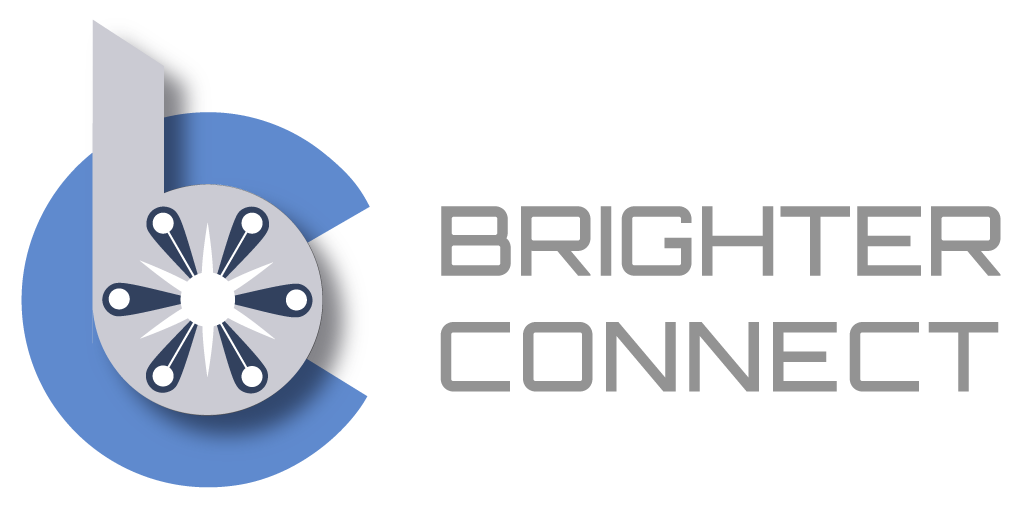
Brighter Connect Brandmark/logotype

  • Post author By adarabi
  • Post date 27 March 2018

I was asked to conceptualise a logo for a recruitment and training startup based locally, here in London.

Having read the brief, I wanted to create a simple yet effective brandmark that would constitute a trustworthy, reliable style that would lend itself well to an app icon for the future development of the business. I chose Orbitron as the logotype as it met the criteria for the brand and melded well with the brandmark when I placed them proportionally next to each other.

The overlaid shapes are all in exact ratios to each other according to the golden ratio (1:1.61803398875). I also added the drop shadow to differentiate the two main shapes and give some depth/dimension to the brandmark.
← Mediarite Logo Development → 4G Tunisia 2018 – Lightning Speeds

  • LinkedIn
  • Facebook
  • Instagram
  • Skype
  • Vimeo
  • Behance
  • Email
  • CV

© 2025 Alexander Darabi BA (Hons) Digital Animation

Powered by WordPress

To the top ↑ Up ↑