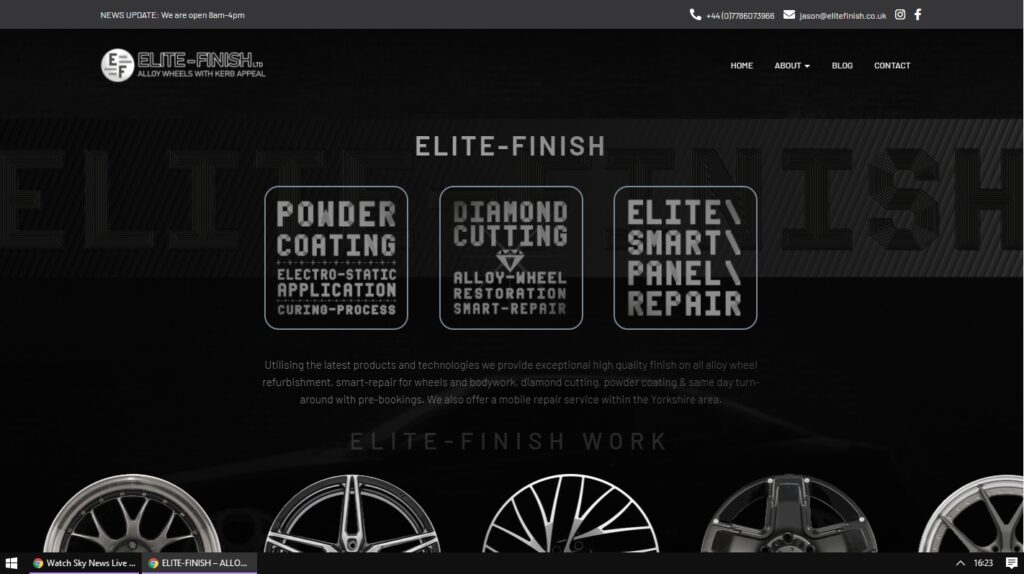
Recent small-business online presence including SEO optimisation and logo redesign. Animated landing page with scrolling alloys GIF (CSS property = overflow: visible;)

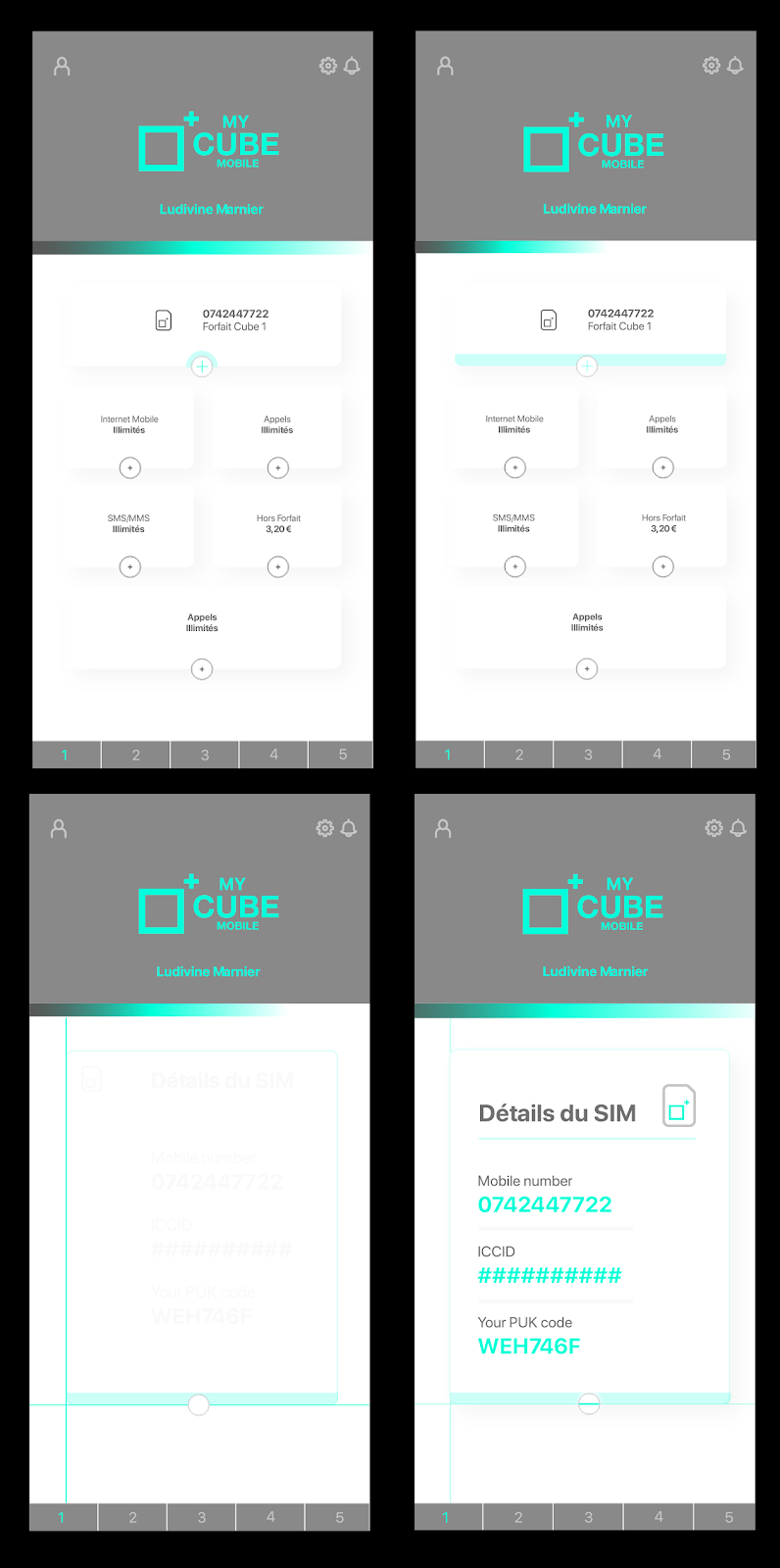
I have recently been working on a white-label service developed in partnership with Lycamobile. My opposite number in Switzerland, Jean Rodriguès, has been art directing the project and gave me a good starting point in-keeping with his vision which I was able to adapt using Adobe XD.
Adobe XD is a very powerful and free UI/UX layout tool for designing website and app UIs (user-interfaces) inn a very simple and intuitive fashion, similar to Sketch. An especially nice feature of XD is the use of art-boards as frames and by utilising the “Auto-animate” feature in the transition type, you can control almost every aspect of an animation from one screen to another when prototyping so that any developer can either interact with, view a video of, or even export UI elements from as CSS classes or SVG vector animations. XD visuallises this in much the same way of nameclasses whereby the software predicts the frames between each art-board (so long as the animated element is named the same on both art-boards). The potential becomes even more apparent when plugins can even allow for exporting as React Native code.
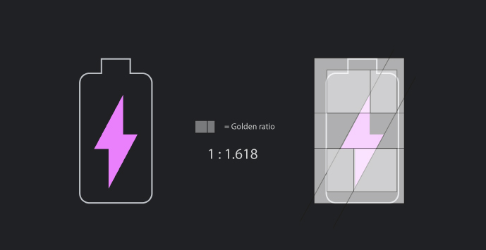
Whilst looking at Google’s new “Dark Theme” for Android’s latest installment (Android Pie) I noticed one of the icons looking almost too balanced to be an artist’s rendition (too perfect if you will). On closer inspection I realised that all the lines are separated by proportions found in nature’s golden-ratio. Whether this was intentional or not, by overlaying the box below, I was able to identify the use of the golden ratio.
Google Material is an excellent place to learn about Google design implementation and also the reasoning behind each design choice. When we can see the mathematical formula for beauty coming to light in their resources it proves they are still the world leader in user-interface (UI) and user-experience design (UX).

:: Future development :: look at other ways of using golden ratio area formatting in 2D and possibly 3D. also when thinking on a grander scale one could draw parallels between cell division proportions and growing patterns found in all living things but more apparent in simple single celled organisms. like corals (formed by a type of algae).
Campaign landing page refresh including style sheet assets for the developer to integrate to his/her own CSS library
Layouts created for a new white-label product being up-sold by Lycamobile and subsidiary brands. I was very happy with the way the final result came out. I am moving more and more into User experience layouts for web and apps where the page balance must work in both mobile and desktop views, with the emphasis being on mobile when the current usage is approaching 60% of all web sessions. I also wanted to keep the use of colours to a minimum, maintaining brand consistency with Lycamobile which is key to the success of this project (allowing piggybacking of trust from Lycamobile)
Exciting new white-label product with branding created in-house. Below is an element of the campaign meant for successful CTR.
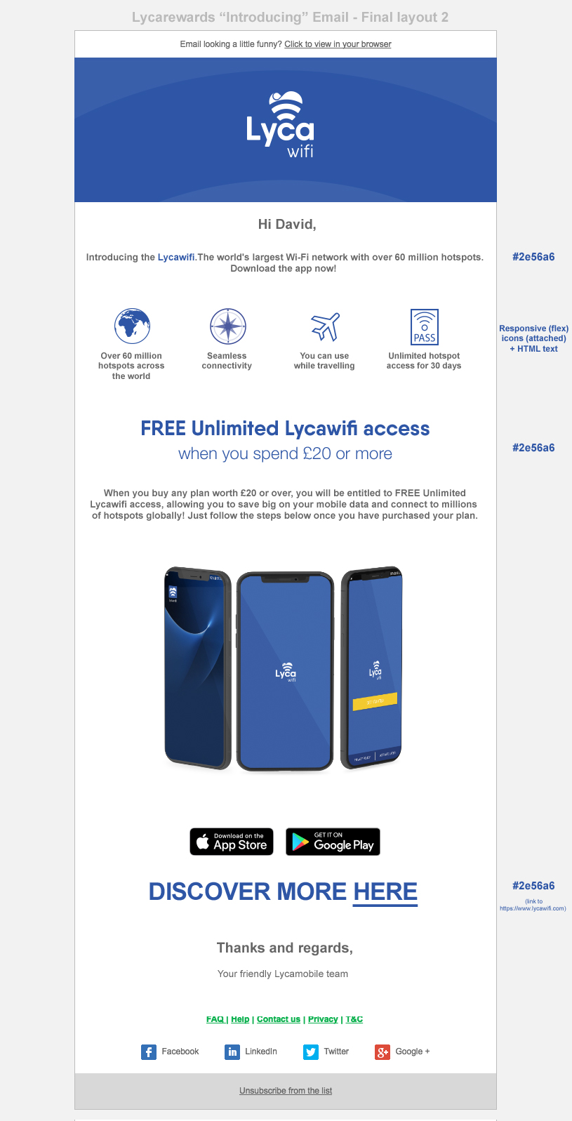
I was asked to create a layout for an email template which I also prototyped/tested in codepen. I really like how much opportunity for developing email as a channel of direct communication to the customer and also the opportunity for creating a consistent look and feel, perhaps even a narrative over the course of weekly updates. I used a layout template from my email-management days to highlight the new bvranding to maximum effect and by keeping colour choice and the elements to a minimum a good balance of white-space, text and imagery can be acheived. Often taking things away is the solution but not so much as to whittle things down too much.

I was asked to produce an email template to roll-out a new product for Lycamobile. The jungle themed header was devised to give a sense of rapid growth and reward. The graphic element in the footer (repeated below) also contrasts to the organic jungle form and gives a sense of structure and pieces falling into place, like a jigsaw.
An example of display advertising on the Polish radio station website “Radiostar”.
The design was inspired by an event I attended at the O2 and also the creative that was already on the website (showing a music gig). I hoped that this would strike a resonance with regular visitors to the website and also enhance the ATL marketing taking place within the Polish segment. Paramount to this was of-course keeping the branding consistent and inline with the whole campaign, but also being highly visible on a high traffic website without being too in your face!

In-game screenshot (concept) for the project I have been working on in my spare time. Essentially “Harmonium” is a real-time exploration/collaboration within the setting of the milky-way. Players will be able to make music alongside others whilst orbiting planets and other heavenly bodies to shape and form the appearance of the galaxy. The UI will be upgradable with different instruments and filters that will also reflect the form of the spaceship and the visual energy it emits. The Player will be able to choose from a variety of techniques to navigate the galaxy including: homing in on other friends/users, setting trajectories for light speed travel, working out orbits to gain lead positioning on the planet jams or via a linked handheld application that will allow users to target planets in real life through augmented reality. I am currently producing a moode board for the project that will give further insight into the look/feel and features of the game. Watch this space!