
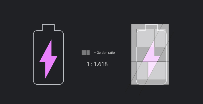
Whilst looking at Google’s new “Dark Theme” for Android’s latest installment (Android Pie) I noticed one of the icons looking almost too balanced to be an artist’s rendition (too perfect if you will). On closer inspection I realised that all the lines are separated by proportions found in nature’s golden-ratio. Whether this was intentional or not, by overlaying the box below, I was able to identify the use of the golden ratio.
Google Material is an excellent place to learn about Google design implementation and also the reasoning behind each design choice. When we can see the mathematical formula for beauty coming to light in their resources it proves they are still the world leader in user-interface (UI) and user-experience design (UX).

:: Future development :: look at other ways of using golden ratio area formatting in 2D and possibly 3D. also when thinking on a grander scale one could draw parallels between cell division proportions and growing patterns found in all living things but more apparent in simple single celled organisms. like corals (formed by a type of algae).